


As part of this exploration, we worked with interior designer, Lauryn Stone, who regularly creates spaces based on her clients’ energy. She used her keen intuition to design schemes inspired by auras of our UF team.
Be sure to follow along the next few weeks as we explore more aura readings and how our color energy translates into design.
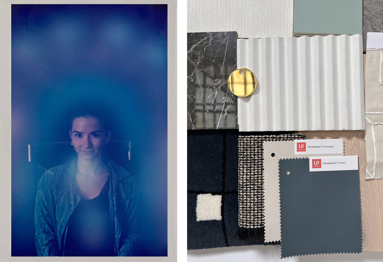
Our last employee feature had a rather unique aura reading. Digital Marketing Associate, Hope Harrington’s colors mainly represented creativity which is exactly in line with the qualities she posses to get her job here done at Ultrafarbics.
By using various tints, tones and shades of turquoise, interior designer Lauryn Stone created a palette that was mysterious yet bold. The use of monochromatic was combined with accents of unlacquered brass, salmon colored oak, and an ochre alabaster that helped bring the aura reading to life.
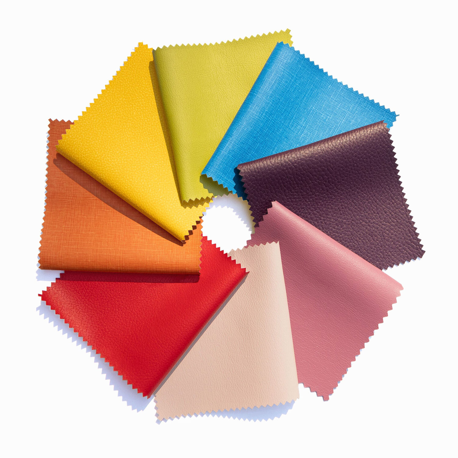
View the Ultrafabrics that were use in Hope's design scheme:
Tottori Blue Mirage 601-2622
Promessa Tusk 363-3464
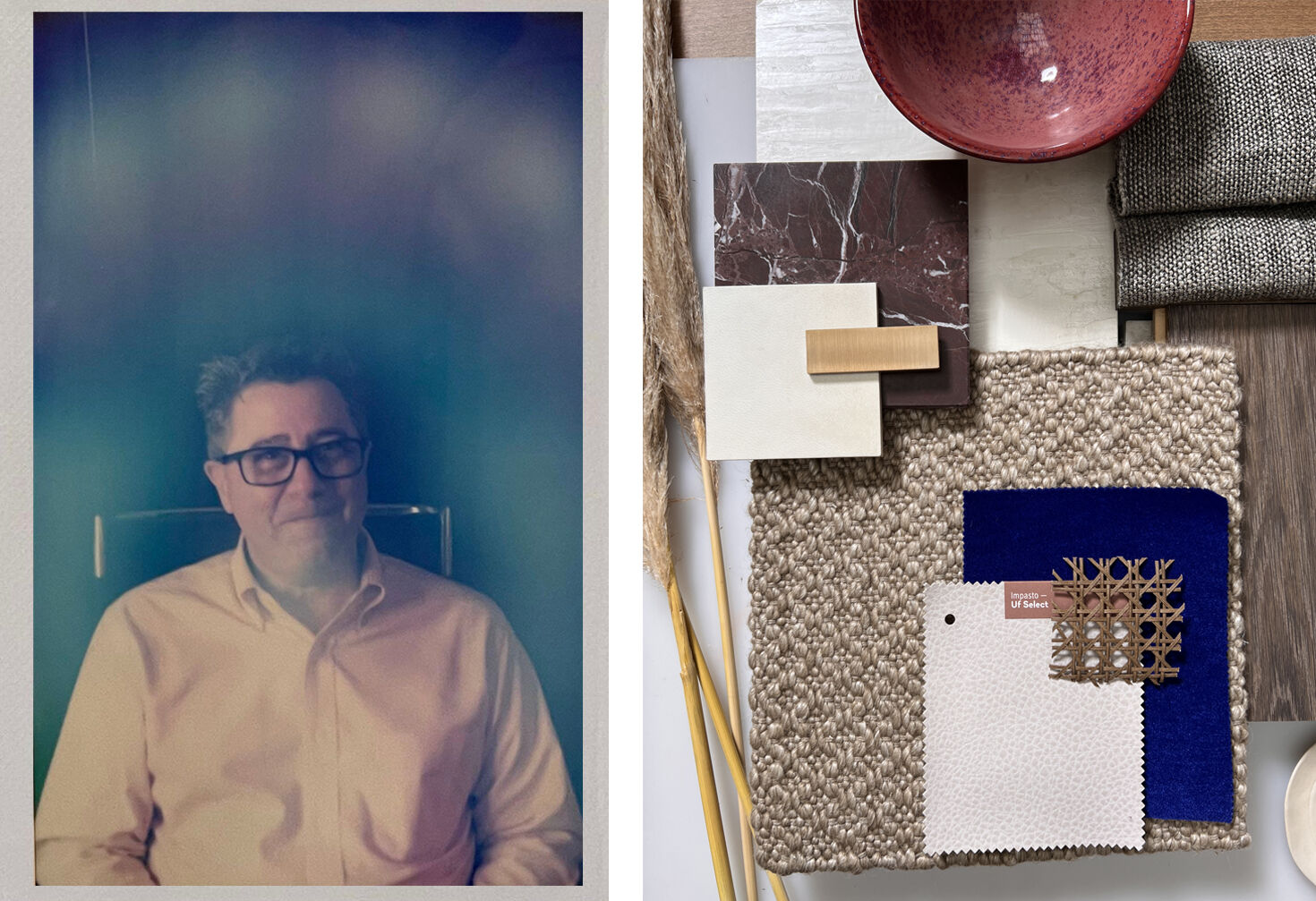
Rich, warm, inviting. Our Director of Residential Sales, Jeff Smith's aura scheme is designed to be an inviting space.
“I loved this aura because there is this inherent sense of the unexpected. I used Almond Milk from the Impasto collection, which is a neutral color and shocked the palette with a cobalt blue neoprene material, ” designer Lauryn Stone said.
For a space that could be used to spend hours either hosting an epic soiree or simply sipping on a great coffee while enjoying a good book, the colors from Jeff’s aura reading combines white, blue and red to create a tactile warmth and richness.
View the Ultrafabrics that were use in Jeff's design scheme:
Samples Associate
Sophisticated and chill. A calming color palette consisting of warm neutrals designed for our Samples Associate, Kristin Shea.
“When looking at this aura, I immediately knew that this energy was sophisticated yet chill.”
For a warm and rich palette, Lauryn Stone chose shades of burgundy, marsala, and curry to create a Moroccan vibe that had an effortlessly cool effect.
View the Ultrafabrics that were use in Kristin's design scheme:
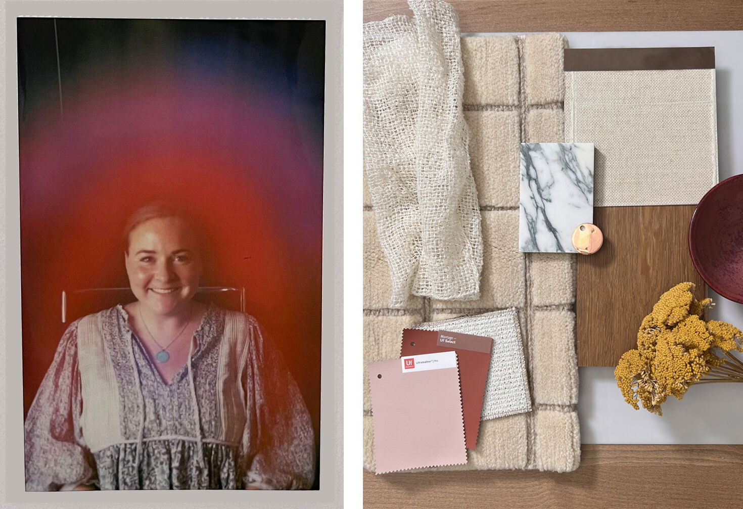
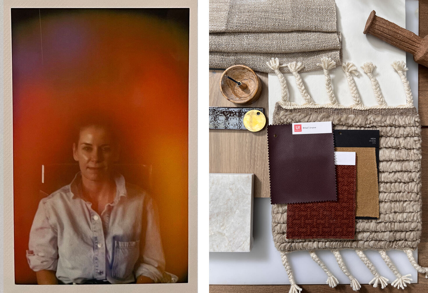
Full, vibrant, and happy. Kealy is a Contract & Hospitality Sales Specialist. Her aura colors of red and pink represent leadership, loyalty and strength, which happen to be the words that came to Lauryn Stone’s mind when designing Kealy’s scheme.
Inspired by the sense of ease and whimsy emanating from the photo, Lauryn curated a boho-chic moodboard that includes quiet bohemian elements with harder elements, like stone and copper, and cheerful Blush and Firebrick materials to further elevate the earthy yet playful vibe.
View the Ultrafabrics that were use in Kealy's design scheme:
Ultraleather Pro Blush 554-7200
Montage Firebrick 744-14223
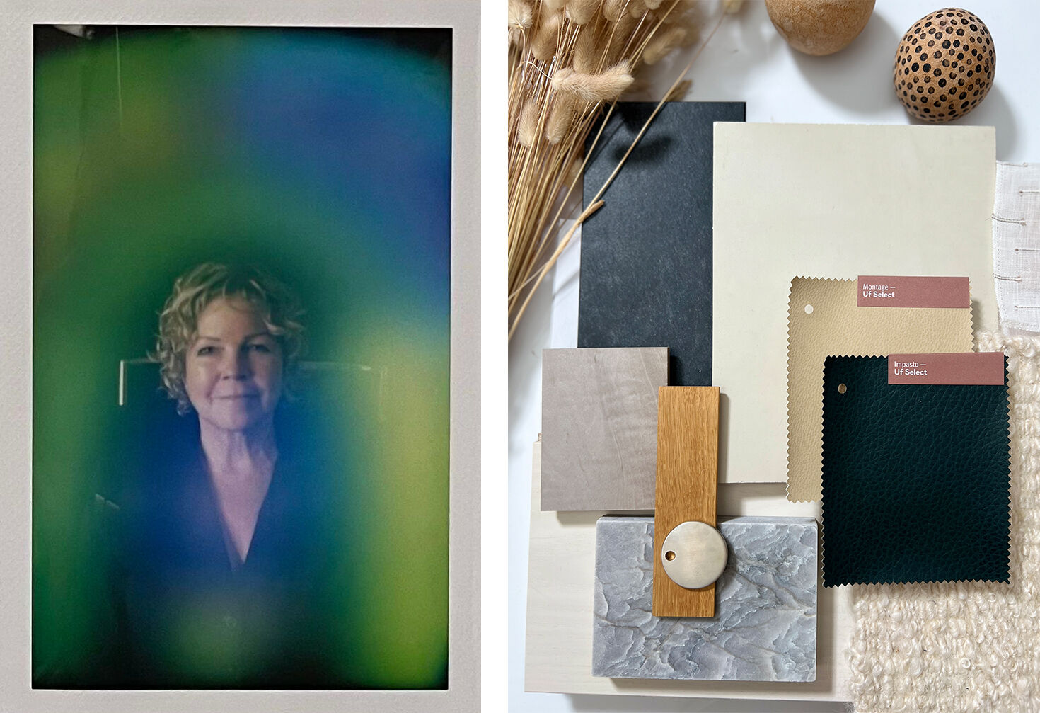
Senior Director of Product Development
"Images of a glistening sea, cool spring sky, and cotton-tails dancing in the wind came to mind when reviewing this aura,” says Lauryn. A backdrop of textures in ivory, limewash and café-au-lait provided the perfect foundation for the hunter green and sand materials, while the sheer roman shade brings in a touch of romance. The result is timeless sophistication.
View the Ultrafabrics that were use in Jennifer's design scheme: