


Color isn’t just pretty to look at. Its power reaches far beyond the aesthetic, with documented effects on human emotion, cognition, and even physiology. In fact, there’s an entire field devoted to our susceptibility to color: color psychology.
Although scientific exploration of color’s utility is relatively new, humans’ harnessing its tangible impact dates back centuries. Ancient Egyptians, for example, incorporated color into their healing practices. This tradition came from the Egyptian god of knowledge, Thoth, who introduced the use of colored salves, crystals, and dyes as medicinal remedies. In the 20th century, psychiatrist Carl Jung developed a theory of human personality centered on color. Incorporating art therapy into his treatment methods, Jung identified the colors that his patients would choose to paint with as indicators of the inner workings of their psyches.
Today, color psychology is frequently employed in interior design, allowing designers to create deliberate spaces that evoke a desired mood or mindset. For an exemplary case of this intentional use of color, we travel to San Jose, California, where Adobe’s HQ office building has just undergone a massive makeover.
Adobe, the design software company behind Photoshop, is an organization already uniquely conscious of chromatics—it follows that its office spaces would be too. In collaboration with design firm LOVE GOOD COLOR, Adobe created a layout for their HQ building that gives color a distinctly definitional purpose.
The rooms are color-coded, with each shade selected to engender a targeted, psychological effect.
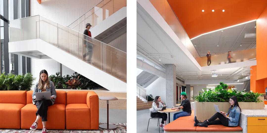
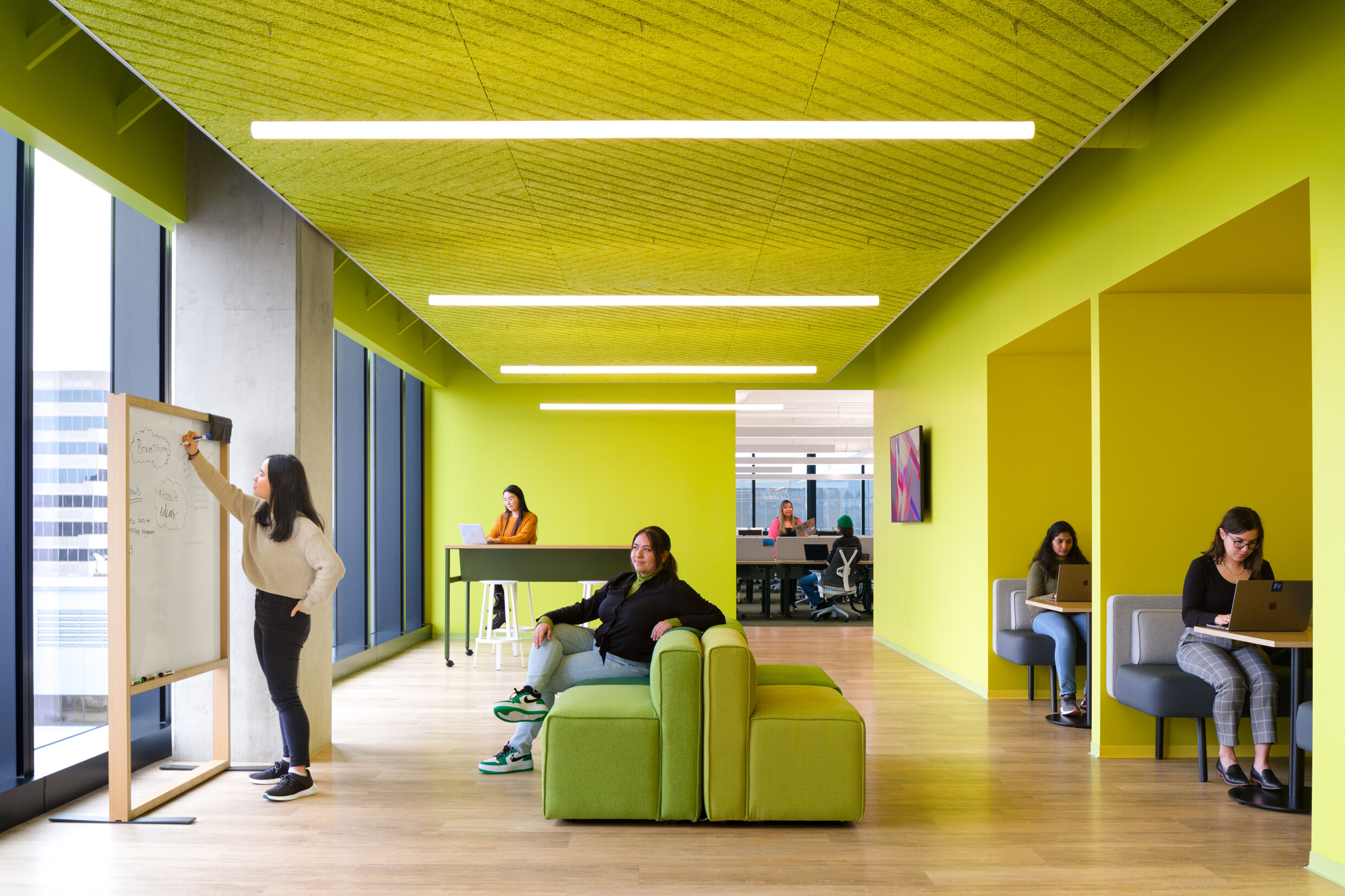
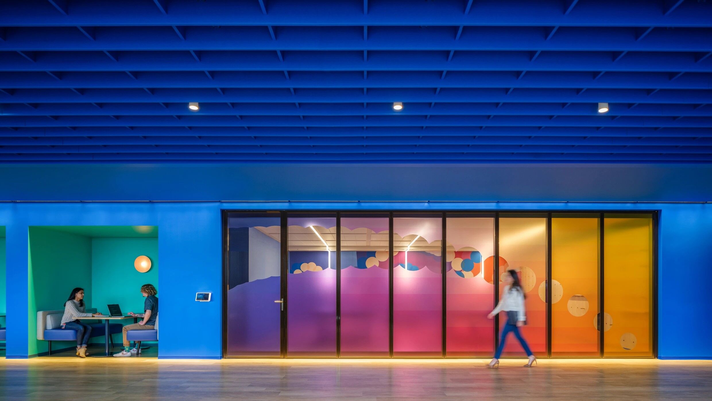
Meeting rooms and team hubs, for instance, integrate hues of green, encouraging creativity in employees’ brainstorming processes. Oranges and burgundies can be found in the building’s two-story break room, there to facilitate social interaction between departments. Spaces for independent work, like desk areas and semi-private work booths, are covered in shades of blue to promote intellectual clarity.
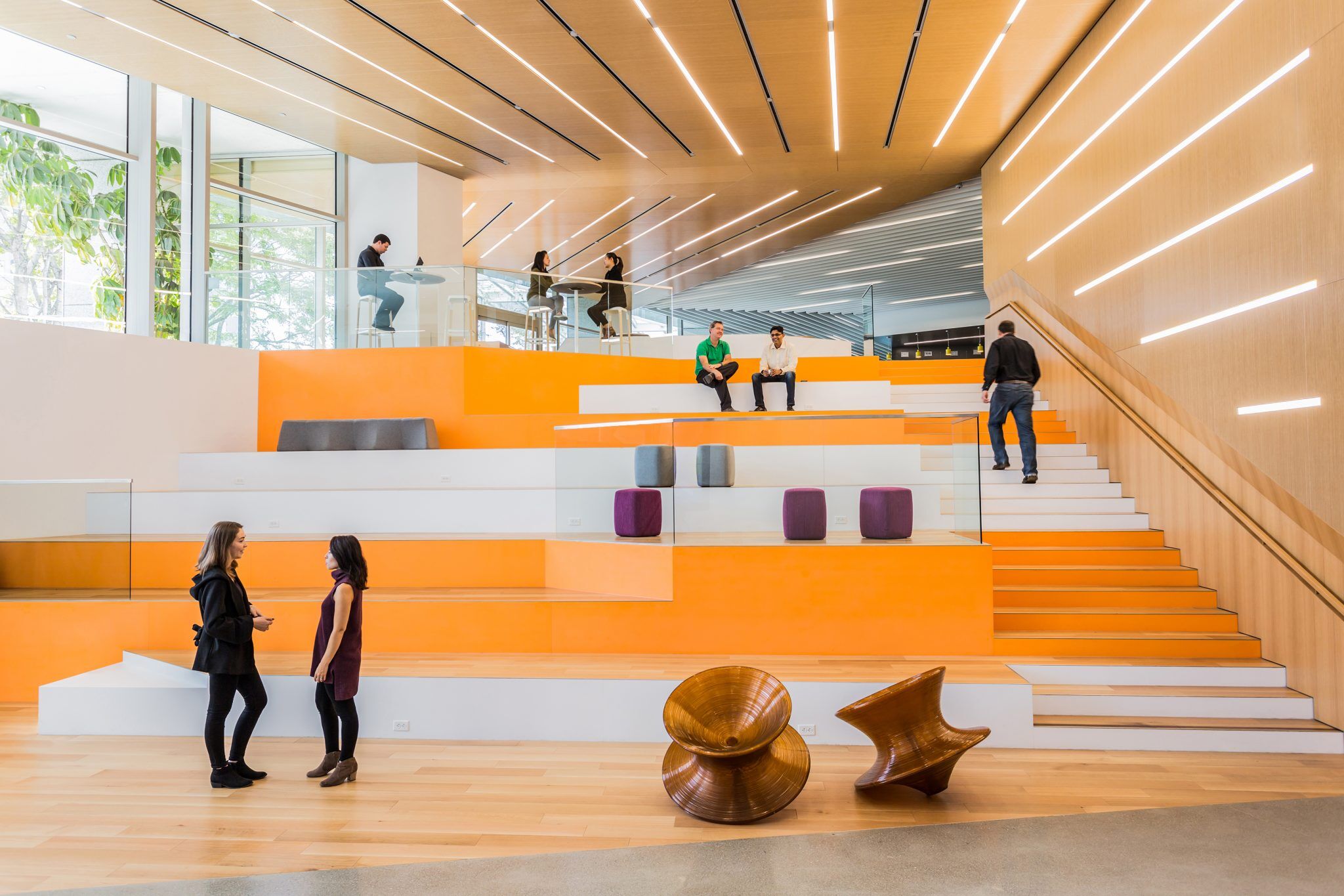
When employees first enter the building, they encounter a lobby peppered in a cheery orange hue. In an interview with the Wall Street Journal, architectural designer Natalie Engels revealed that the shade was chosen because it lends a buoyant vibrancy to the space.
Employees may get stuck in traffic on their morning commutes, she explained, and the color allows them to enter “and just feel refreshed.” Engels adds that the specific shade of orange has just “the right amount of yellow in it,” so that it’s energetic without being overwhelming.
Standing at 1 million square feet, Adobe’s headquarters is enhancing work-life for over 3,500 employees. Color is integral to the space’s ability to foster productivity and wellness, hand selected for over 400 environments including “’team neighborhoods, focus rooms, collaboration zones, drop-in desks, [and] adventure rooms.’” Gloria Chen, Adobe’s Chief People Officer, sums the project up perfectly: “’color psychology is used throughout the building to guide people to the spaces that most naturally fit their need.’”
We’ve handpicked a few of Ultrafabrics’ favorite greens, blues, and oranges for your perusal. The next time you’re seeking to elicit a specific mood, remember these colors’ psychological effects, and design a space with purpose.
554-8251 Ultraleather Pro Melon