


Blue: The Color that Brings Us Together
As we inch closer to summer, we dream about days spent on the water under clear, cloudless skies. Whether it’s by the pool or the ocean, we imagine enjoying the warm breeze and the feel of salt on our skin. Throughout these sun-soaked images, one color is constant: blue. From the aqua of a backyard pool to the sapphire of the deep ocean, shades of blue conjure the restorative, calming months of summer.
It's hard to dislike such a soothing shade. Indeed, across the globe, blue stands unrivaled as the most-favored color. One YouGov survey found it to be the most popular color among participants from 10 different countries, including the US, China, and Germany.
This preference for blue also transcended differences such as gender, age, and political affiliation. Such universality, when paired with its inherently inviting nature, makes blue an ideal choice for designers creating shared, communal spaces.
.png?h=2000&iar=0&w=1715&rev=62b40a55-b5f9-4431-94d4-895e859ba744&hash=78A9A38E8B63CD6040C36BD62A935CD6)
In Osaka, Japan, studio I IN designed a Blue Bottle shop’s interior around the coffee brand’s iconic blue logo. The team’s vision was inspired by the neighborhood the store is located in. Chayamachi is known for its unique Japanese tea culture, which brings individuals together from far-reaching places. Standing islands topped with luminescent, blue glass permeate the first-floor space, encouraging social engagement. On the second floor is an installation area washed in bright blue light.
Made in collaboration with design practice Panoramatiks, it stands in the center of the room, sectioned off from the rest of the space by ombré glass partitions. Within, customers can sit with one another in the blue glow, enjoying music that’s engineered to cascade down from overhead.
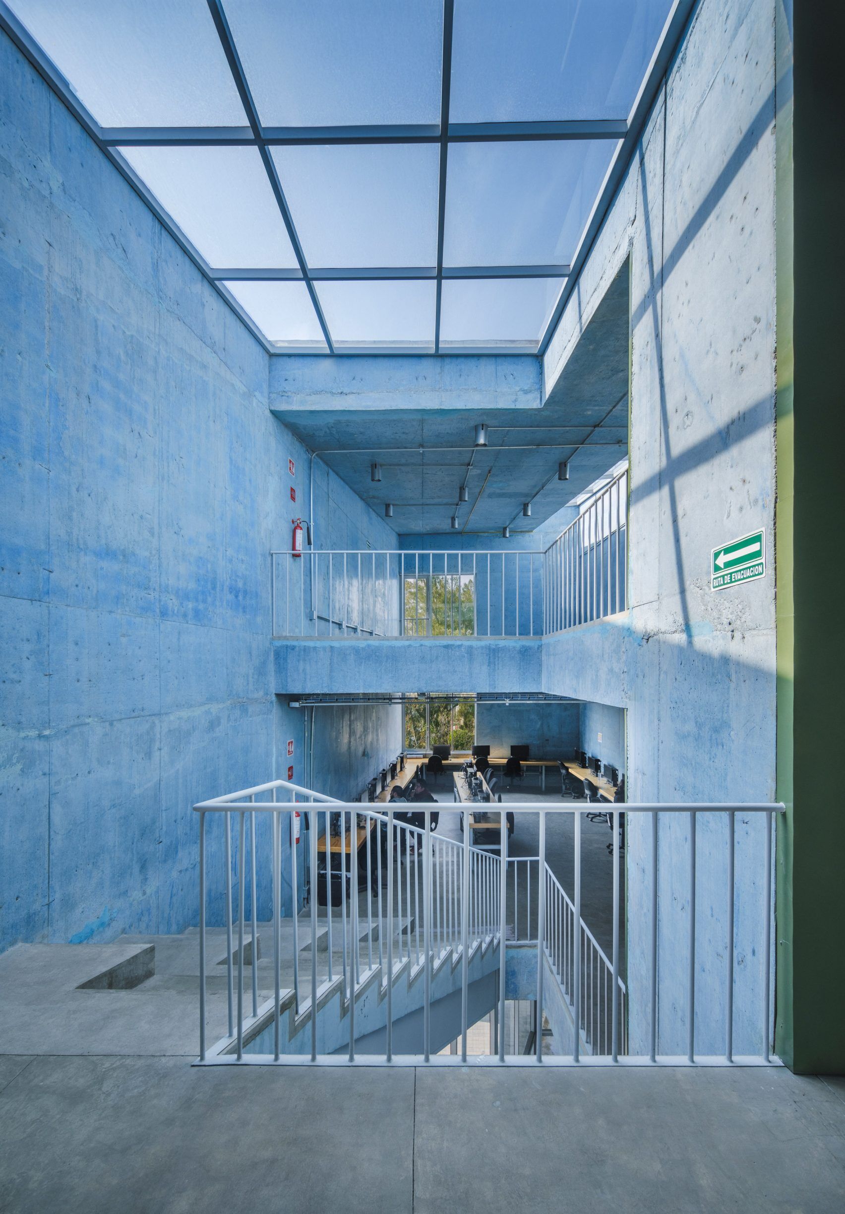
Firms WORKac and Ignacio Urquizia Architects created a community center in Mexico City, Mexico, selecting blue as their central color. The building was commissioned by government initiative PILARES, which works to create opportunities for underserved communities in the city. Meant to promote ‘”cross-generational gathering,’” the center is constructed entirely of blue-dyed concrete.
The designers chose the material for its structural and thermal efficiency, and its bright blue hue is a nod to the vibrant colors of the surrounding architecture. With three split levels, the interior of the building contains open rooms that are designed to be fluid and adaptable: their intended purpose is wide-ranging, from cultural programming to skills-building workshops to leisure. The refreshing blue shade is unmissable, a deliberate choice by the design team.
“’The sites selected for [each PILARES] construction create new landmarks in the urban fabric, enabling the population to identify them as community meeting centers that promote the regeneration of social life.’”
/Untitled-design-(4)/Untitled-design-(4)/Untitled-design-(7).png?h=2000&iar=0&w=1715&rev=d20d7c00-16a6-4dd0-b763-d587c86e30b7&hash=FB516E2C570EB2BC1B4C64B0F831C604)
From periwinkle to indigo, Ultrafabrics’ blue shades span the spectrum. Peruse a few of our favorite blue hues here: