


September 20, 2022
Sight Unseen's Monica Khemsurov Materializes Her Aura
The idea that color surrounds us is not novel, but the idea that it actually surrounds us and expresses our true selves as an electromagnetic field (otherwise known as an aura) might be.
In our first influencer focus of our Experience Hue campaign, we talk with Monica Khemsurov, curator, design consultant, and co-founder of Sight Unseen.
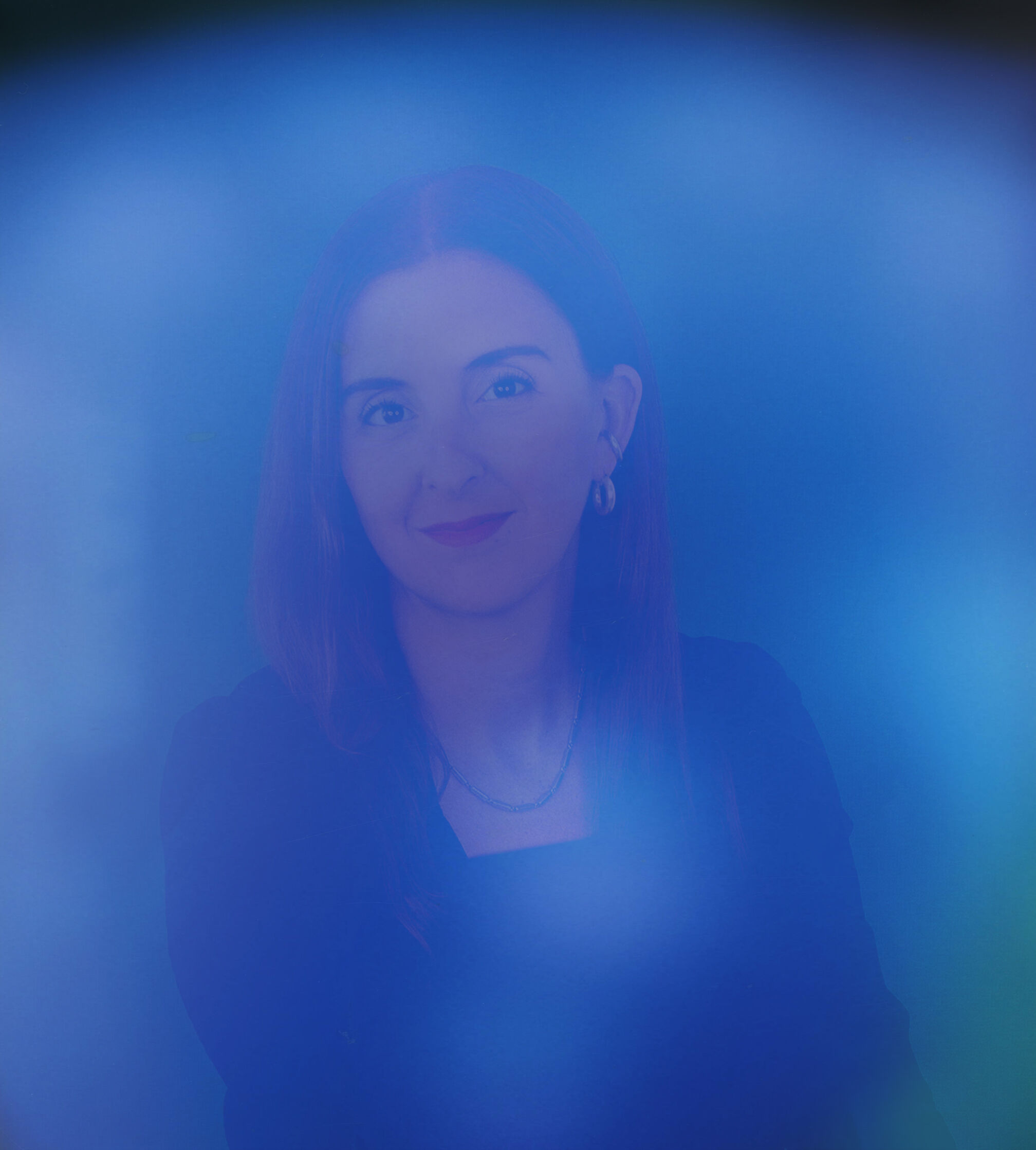
Monica’s aura experience was as expected – sit down, place hands on metal sensors, and snap a photo. The pleasant surprise came from being “read” as 3 of her favorite colors – purple, blue, and green.
Her main color was a saturated blue which faded into purple in some places and periwinkle in others with a splash of green on the side. She learned that blue indicates communication and a calm state that protects loved ones while purple represents her intuitive self. Green symbolizes a loving kindness toward plants, family, friends, and animals.
As someone who enjoys being a support to others and uses her intuition and intellect to do so, she felt these colors was an accurate depiction of her personality. Perhaps the biggest connection to her aura was the relationship with nature. Monica finds fulfillment and happiness from the outdoors - green trees, blue skies, colorful animals, and plants - and she brings these colors inside to surround herself with that peacefulness.
In our first influencer focus of our Experience Hue campaign, we talk with Monica Khemsurov, curator, design consultant, and co-founder of Sight Unseen.
Monica’s aura experience was as expected – sit down, place hands on metal sensors, and snap a photo. The pleasant surprise came from being “read” as 3 of her favorite colors – purple, blue, and green.
Her main color was a saturated blue which faded into purple in some places and periwinkle in others with a splash of green on the side. She learned that blue indicates communication and a calm state that protects loved ones while purple represents her intuitive self. Green symbolizes a loving kindness toward plants, family, friends, and animals.
As someone who enjoys being a support to others and uses her intuition and intellect to do so, she felt these colors was an accurate depiction of her personality. Perhaps the biggest connection to her aura was the relationship with nature. Monica finds fulfillment and happiness from the outdoors - green trees, blue skies, colorful animals, and plants - and she brings these colors inside to surround herself with that peacefulness.
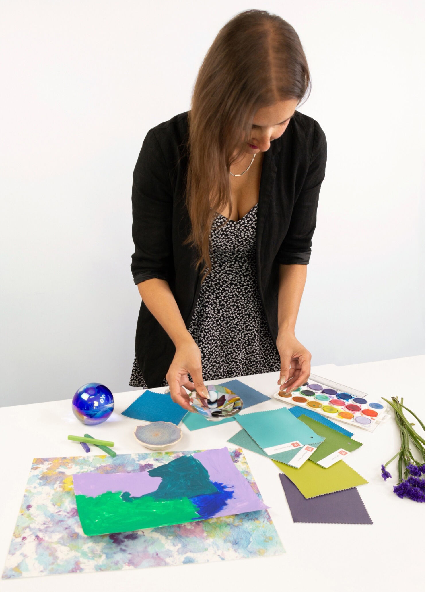
Bringing her aura reading to life, Monica designed a mood board. She included statice flowers to connect to her love of nature and included pieces from her personal glass collection that mirrored how she felt when looking at her aura photo.
“I thought that captured the feeling of the aura photo – inside something transparent but also had colors or a feeling.”
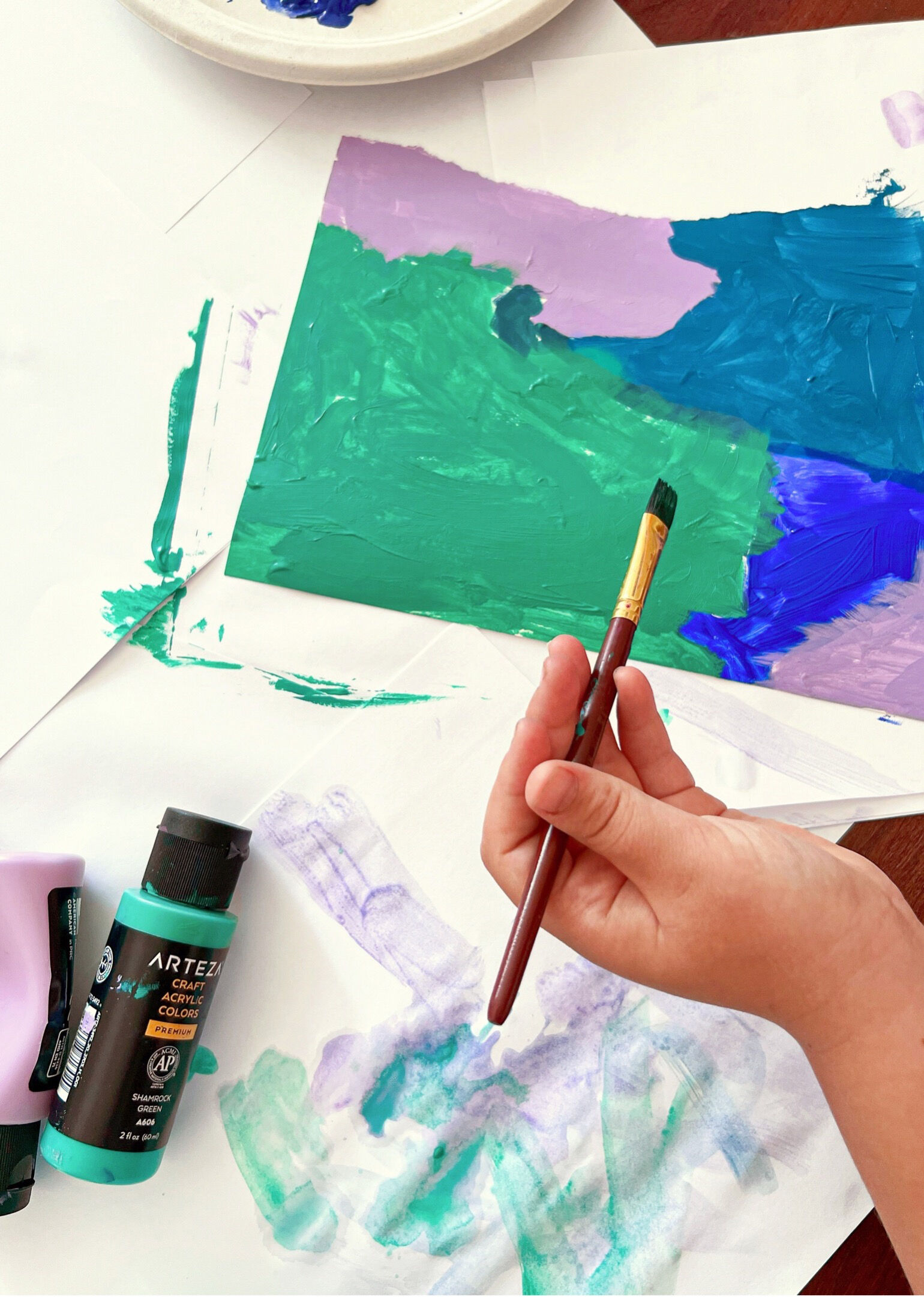
Inspired by the concept that children can access their intuitive self-expression in a way that adults may not be capable of, she encouraged her friend’s 7-year-old daughter to create a painting with blue, purple, and green. This mimicked her aura’s ombre-like effect and created a flow between the colors in her design.
“That’s what the aura photo represents – energy or intuition becoming physical/visual. I liked the connection between the child's art and what the aura photo captures.”
“I thought that captured the feeling of the aura photo – inside something transparent but also had colors or a feeling.”
Inspired by the concept that children can access their intuitive self-expression in a way that adults may not be capable of, she encouraged her friend’s 7-year-old daughter to create a painting with blue, purple, and green. This mimicked her aura’s ombre-like effect and created a flow between the colors in her design.
“That’s what the aura photo represents – energy or intuition becoming physical/visual. I liked the connection between the child's art and what the aura photo captures.”
Beyond human auras, Monica believes objects also have energies. Depending on how an object is acquired, for example, may give it a certain meaning which then impacts its energy within the space it occupies. That energy radiates throughout the space, passes to the visitors of the space, and connects those people to the object and to its owner. Monica advises that when designing interiors, focus on the objects inhabiting the space and how they make you feel more than the more traditional way of decorating.
“Usually, you can achieve personality through form, but color takes it up to the next level and helps you build a layered space that has personality and emotion in it.”
Sight Unseen is releasing a book, “How to Live with Objects” that delves deeper into this topic, set for release in November.
“Usually, you can achieve personality through form, but color takes it up to the next level and helps you build a layered space that has personality and emotion in it.”
Sight Unseen is releasing a book, “How to Live with Objects” that delves deeper into this topic, set for release in November.
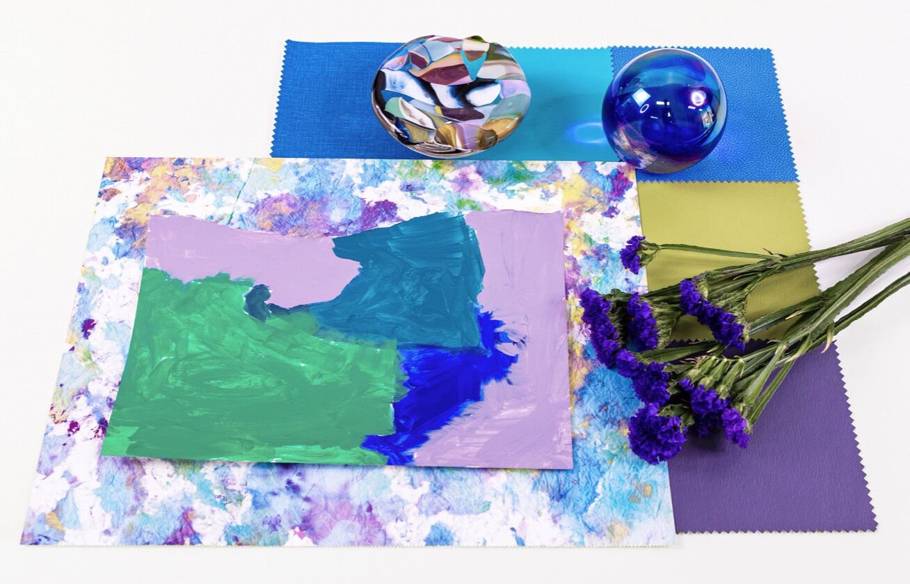
These are the Ultrafabrics materials that Monica resonated with after her aura reading and included in her mood board -
740-25143 Lino Bosporous
624-2722 Reef Pro Saltwater
291-4460 Ultraleather Parrot
554-2530 Ultraleather Pro Sky
291-9385 Ultraleather Plum