Indeed, this hue’s electrifying qualities are fearless. Viva Magenta is not a color to fade into the background, and nor should it be: its saturated beauty is powerful and enticing. Designers across markets have been eager to incorporate it into their palettes, using skillful strategies to make the eye-popping shade work for anyone. For some Viva-Magenta inspiration, we’ve selected a few of their most helpful design tips, ready and easy for use in your next project.
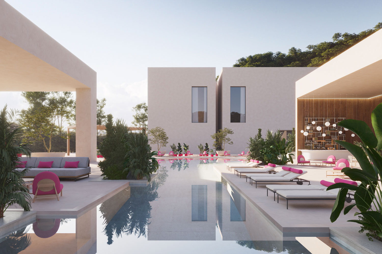
In home décor, Viva Magenta provides a shot of bewitching energy. Sabra Ballon of BallonStudio notes that Viva Magenta is “stylish and vibrant but retains a certain level of sophistication.” In her interview with CNN, she suggests it as a “wonderful option to consider when creating a moodier, sexier space, such as a den, library, or dressing area.”
With respect to color pairings, Blima Ehrehtreu, CEO of The Designers Group, believes that Viva Magenta’s “warm and cool tones [makes it] an ideal accent color for any color scheme.” California-based designer Courtney B. Smith adds that the hue “plays well with greens (especially hints of chartreuse), browns and blues.”
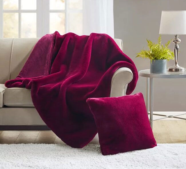
For those ready to harness the full luxuriousness of Viva Magenta, interior designers suggest opting for more-prominent décor components, such as wallpaper, couches, or rugs. Just a bit of the color goes a long way, however, adding bold flavor in accent pieces like pillows, lamp-shades, and flower bouquets. Designer Cristina de Miranda recommends magenta throw blankets for her clients; they brighten a room with color when sprawled on full display, but lend refined subtlety when folded neatly on an ottoman.
In fashion, fuchsia hues have already launched a total take-over, which began with Valentino’s introduction of “Valentino Pink” last year. Since then, berry shades have flooded collections of couture houses like Marni and Rodarte, and public icons like Harry Styles and Kate Middleton have made magenta a staple at high-profile, red-carpet events.
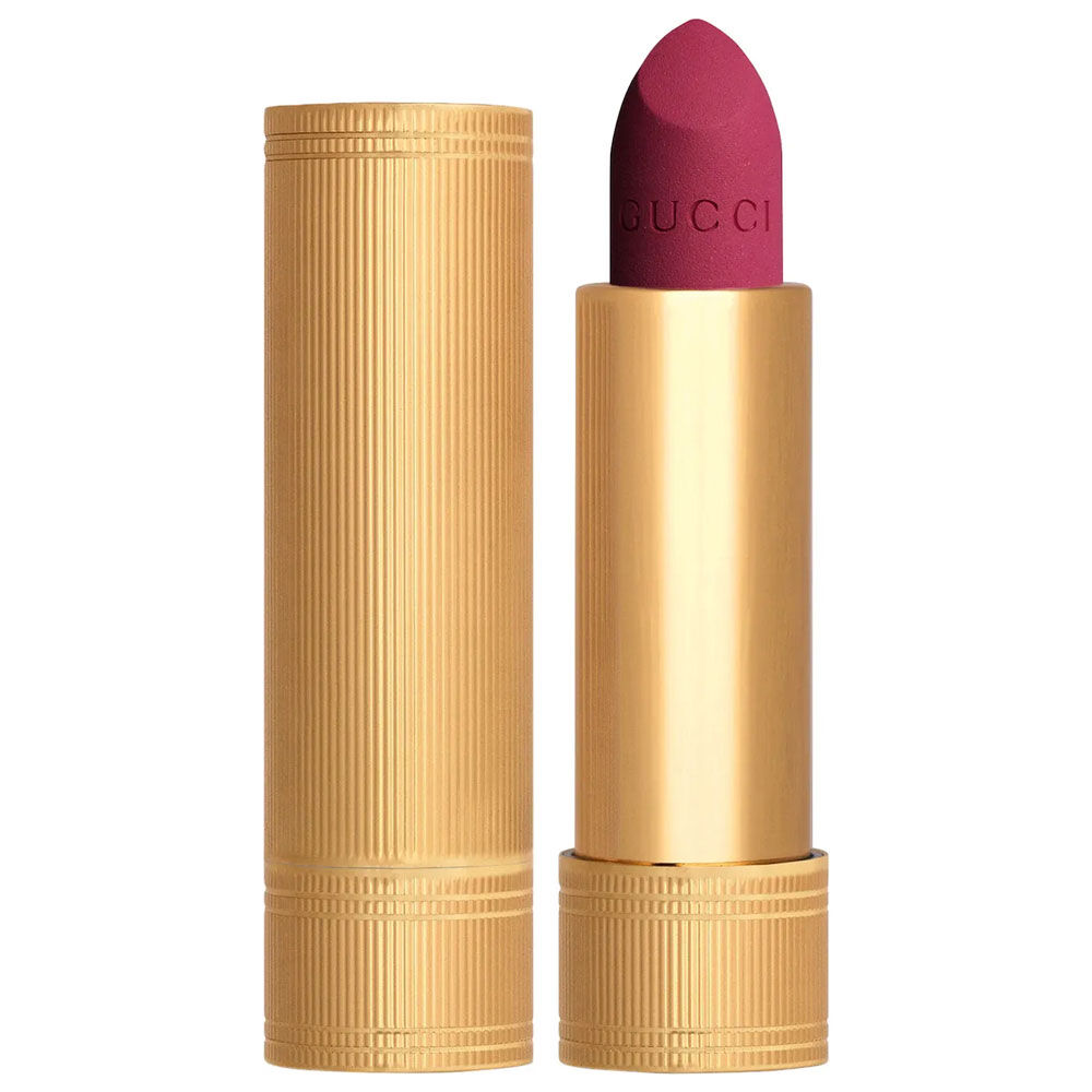
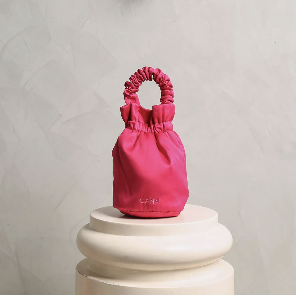
According to a Vogue editors’ list, Viva Magenta “envisages the unconventionality of time, and puts forward an unconventional color to rule the coming year's fashion scene.” Akanksha Kamath, the Indian branch’s fashion features director, believes that Viva Magenta is worn perfectly with an accessory piece—something like a handbag that “packs the punch of the color but the softness of a pouch.” Sonakshi Sharma, junior digital editor, believes that “nothing makes a more powerful statement than a bold lip shade at a soiree,” and touts a “matte lipstick in magenta” as a must-have for readers. Chloe Chou, assistant to the head of editorial content, advocates for Viva Magenta statement shoes; they’re “a great way to add a pop of color and fun to an otherwise assuming outfit.”
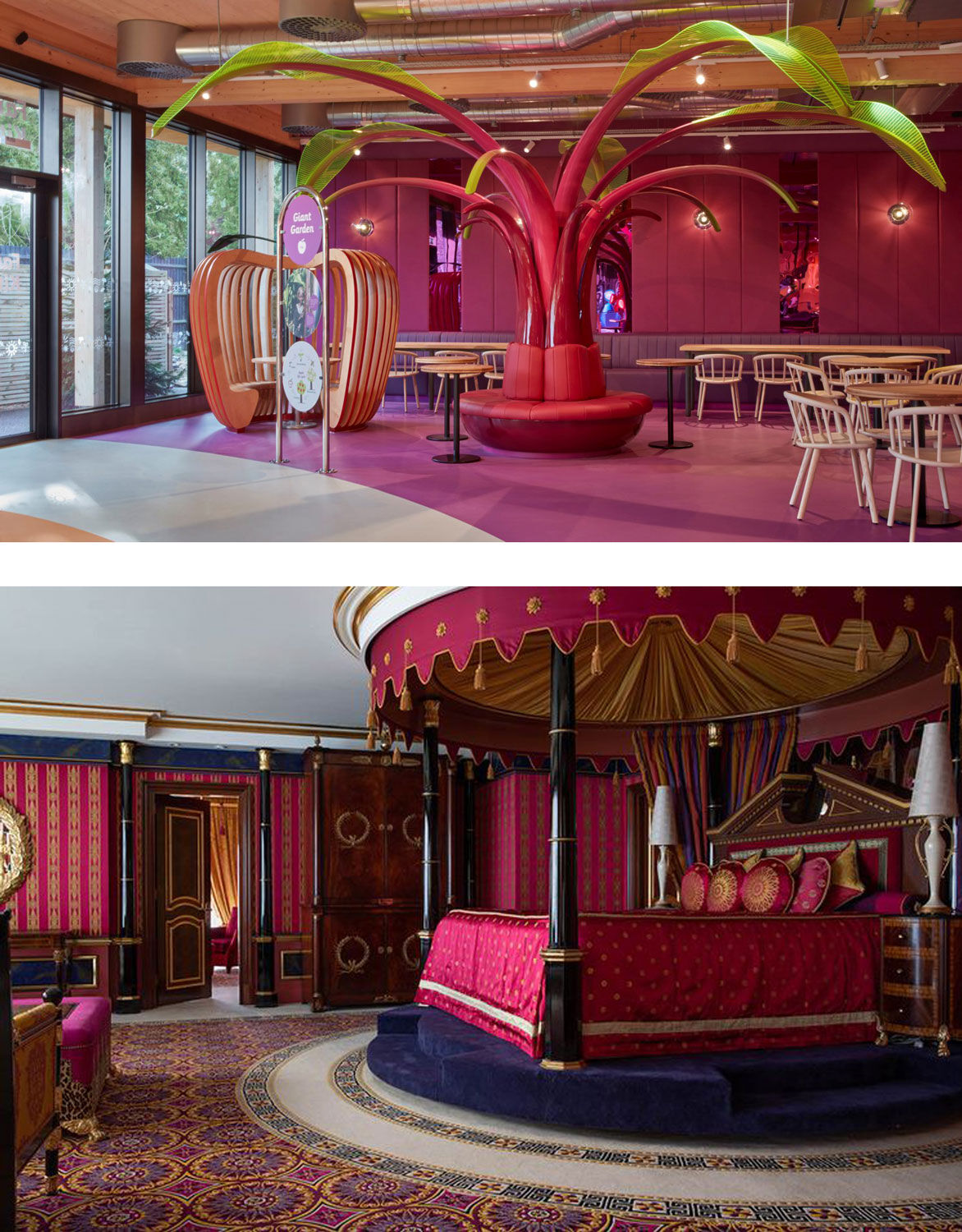
Evoking a completely different ambiance, a Dubai hotel demonstrates how Viva Magenta can be used to produce a more dignified, regal space. Burj Al Arab Jumeirah is renowned for its lavish decor, and the Royal Suite on its 25th floor is nothing short of magnificent. The bedroom’s theme is one of deeply saturated magenta; the color is found on the silk sheets of an oversized canopy bed, an opulently decorated carpet, and even on satin wallpaper. Throughout the room, however, hues of gold, deep blue and rich brown serve to ground the fuchsia’s abounding energy. The combination of these shades would give any space an unmistakable stateliness.